But of course, it's actually quite obvious when you consider what data is being analysed. Lots of mobile phone masts in an area just means that lots of people live in that area and lots of people means lots of births. Hence there's a correlation between the number of masts in an area and the number of births.
Looking at the data, a more interesting analysis would be to take the births per thousand people and correlate that with the number of masts per thousand people in each area. My guess is that there might be a much weaker correlation, but it may still show some interesting effects. For example, is the birth rate higher in areas with greater population density in which more phone masts are erected? Is there more NIMBYism against phone masts in prosperous areas with lower housing density?
This housing phenomenon must be an age-old one and mobile phone masts are just a new proxy for it. I recently researched the history of the defunct mining village of Mavis Valley and in the 1901 census data (which, alas, isn't freely available on the web), I found that 49% of the village's population was under 15. At first I thought "wow, compare that with our aging population these days", but then I realised that the percentages for my own street - about 20 three and four bedroom houses built in 1995 - had a very similar percentage of under 15s. Sure enough, when I checked, I found that Mavis Valley had undergone a major expansion in the decade before the census and so young couples had moved into the new houses and started breeding.
A magnet for numerology and pseudo-science (i.e. nonsense) is the sunspot number time series, which I spent three years of my life studying. Your eye and brain might be attracted by the graph in this example:
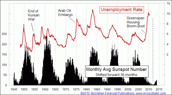
But look more closely and critically and ask yourself these three questions:
- How many graphs did the author compare with sunspot number before choosing to blog about this one?
- A time shift of 3 years was needed to expose the correlation and no data before 1947 is included - is there a reason for these choices other than to improve the correlation?
- There are 10 distinct unemployment peaks but only 4 of them line up with peaks in sunspot number, the other 6 don't. Are you convinced by a sample of 10 data points of which 6 do not agree with hypothesis proposed?
I edited this after realising how simple-minded the Guardian article's analysis was: the correlation is simply because in a given area, more people means more masts and more people also means more births. It doesn't change the point that's being made actually, in fact it actually makes it stronger!
ReplyDelete